iOS Redesign Case Study
I am exploring the user-experience of Remember because it’s a powerful tool that is under-utilized and just short of serving its users the best it can.
The Old App Design
STRENGTHS Currently looking at the product as-is, it has some incredible tools built-in. For example, the automatic geo-location tool, and the social network prompt sync are slick and helpful to the key goal of remembering more names.
WEAKNESSES I think the entry and welcome phase of the product has some mis-steps. Until you have built some content, the tool appears a little over-simplified. Requiring a Facebook Connect as the only registration option eliminates users without a Facebook account. Additionally, there could be a tool built in to remind people to take notes after events or gatherings. Another feature I think would help is giving hints and simple lessons in how to build your name memorization skills.
Research summary
The objective of my research was to gain insight into the pain and problems people experience while learning and forgetting people’s names. The intent of the research was to find a better understanding how many people feel they experience name memory problems, as well as what sorts of tools people already use to help their name recall. The goal will then be to find a way to utilize natural intuitions to help people easily record/recall names.
I chose my research participants based off the personas I created. These are people working daily in a role where remembering names, colleagues, connections, and clients is important to their success. I had originally used teachers in my research but eventually moved away from that after learning in face-to-face interviews that teachers use their own methods for name recall much separate from the way most other people do.
Usability Heuristics Analysis
I have compared the usability of Remember alongside the competitors Namekeeper, Name Shark, and Namerick. Please visit the the report for my full analysis.
Empathy Maps and Personas
MVP Features and User Stories
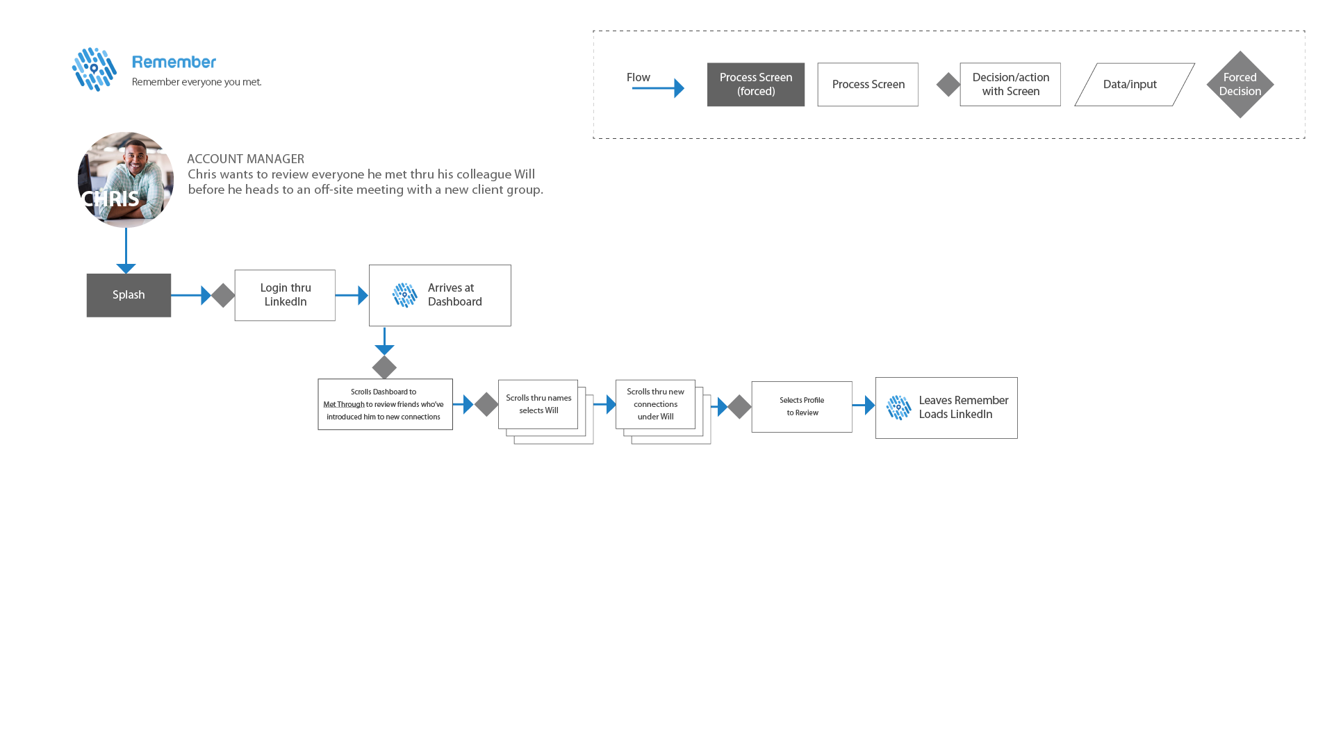
Please visit the user story sheet to explore the user paths I wrote based off of Ruth, Jolene, Chris, and Jill.
Card Sort and Sitemap
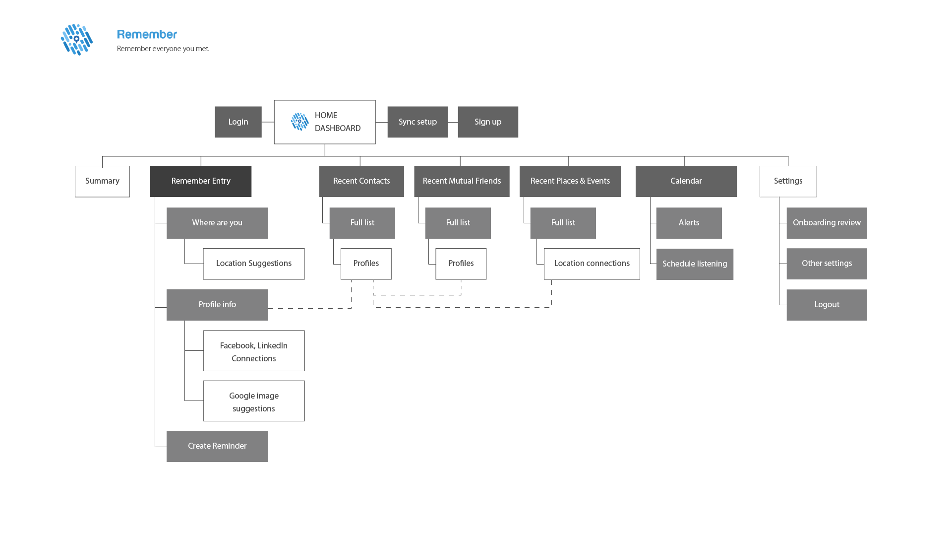
Card sort for the Remember app began with recruiting three people who very closely represented three of my four personas. I saw a theme in most of the process, where all three saw a division of the app into Account Creation or Login, Navigation or Functionality, Network Expansion, Adding a new connection, and Reviewing Existing Connections. The one area where there was a clear division, was adding syncing methods related to finding new connections' social media accounts. These tasks are very related, so the disconnection and overlap makes sense. My users interchanged the terms connection and friends often, so I can probably pursue either route on that terminology. Based on the app's existing layout, I think I have a good grasp on how to add the additional features and still allow a simple user path and experience. I think adding the new functions will be carefully built upon the existing layout, while focusing on keeping the present user-experience similar in-order to build it out while staying familiar and simple.


User Flows


Initial Sketches & Wireframes
In the rough draft sketches and first draft wireframes, I explored three main layout structures for the app. One is basically using the existing UI structure, of a scroll home screen with previews of the secondary screen's content. The second was a dashboard with the main functions offered up front. The third UI structure option is a fixed navigation at the bottom with the app's main features accessible on all screens. I moved forward with option two, as it seemed most obvious how to utilize the functions with the app in this layout and structure.


